Impact & Results
I conducted a detailed UX analysis of developer productivity dashboards that led to a major redesign, resulting in an ~86% improvement in usability. Early prototypes of my designs significantly reduced the average time required to understand data visualizations, positively affecting thousands of engineers and managers at Intel.
Problem Statement
The existing developer productivity dashboards were difficult to interpret and lacked important metrics, leading to inefficiencies in decision-making and reduced productivity for engineering managers and teams. With average interpretation times exceeding 4 minutes, users struggled to quickly understand the data, impeding workflow and hindering effective decision-making across the software engineering community.
Process & Approach
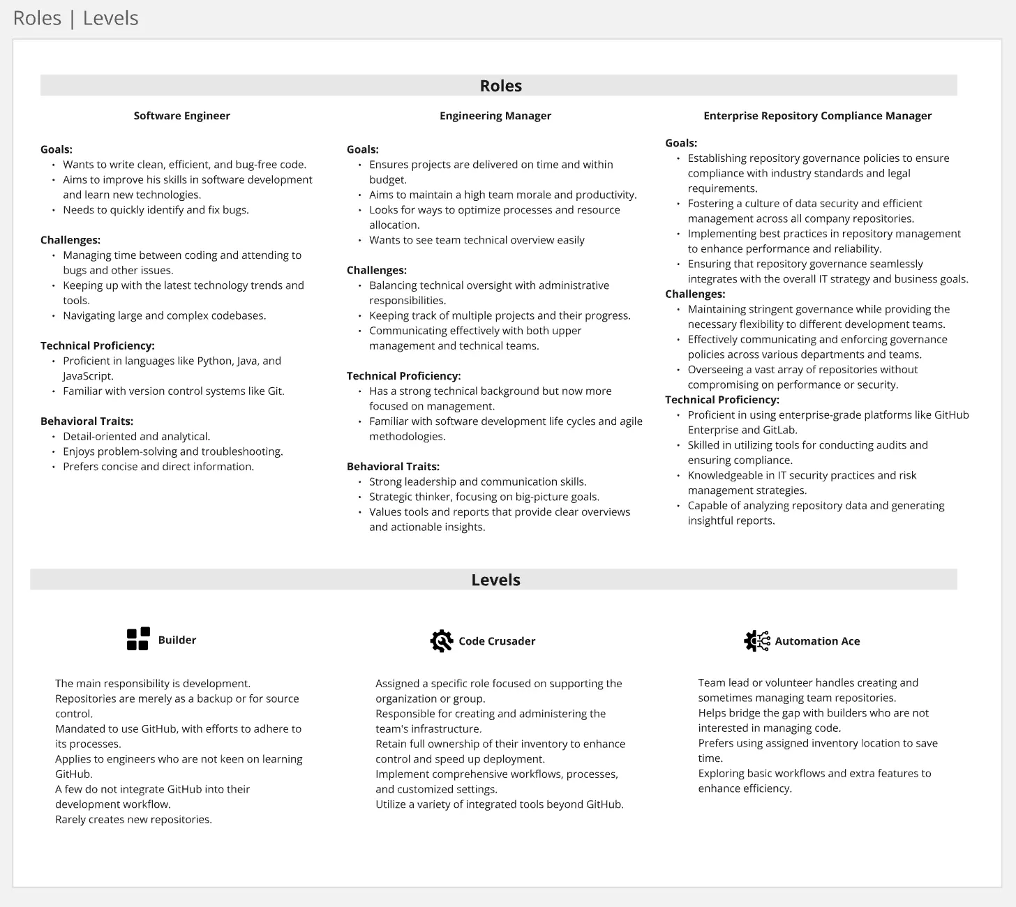
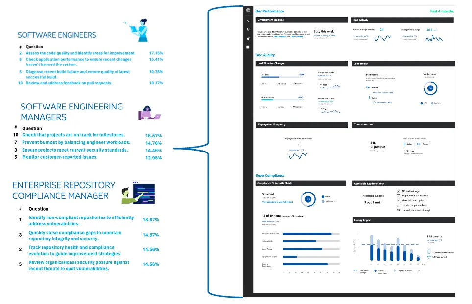
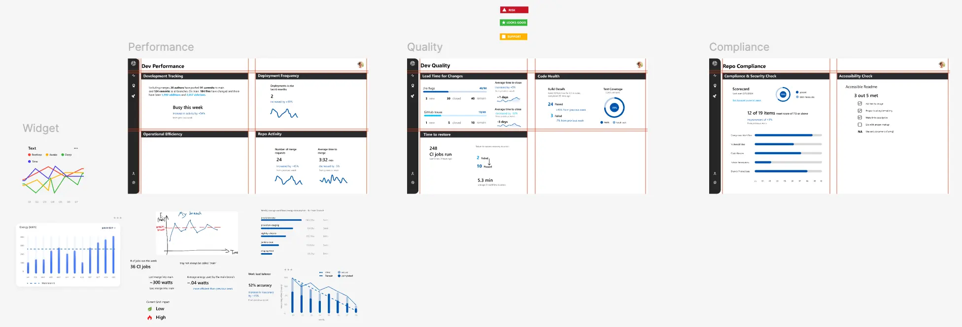
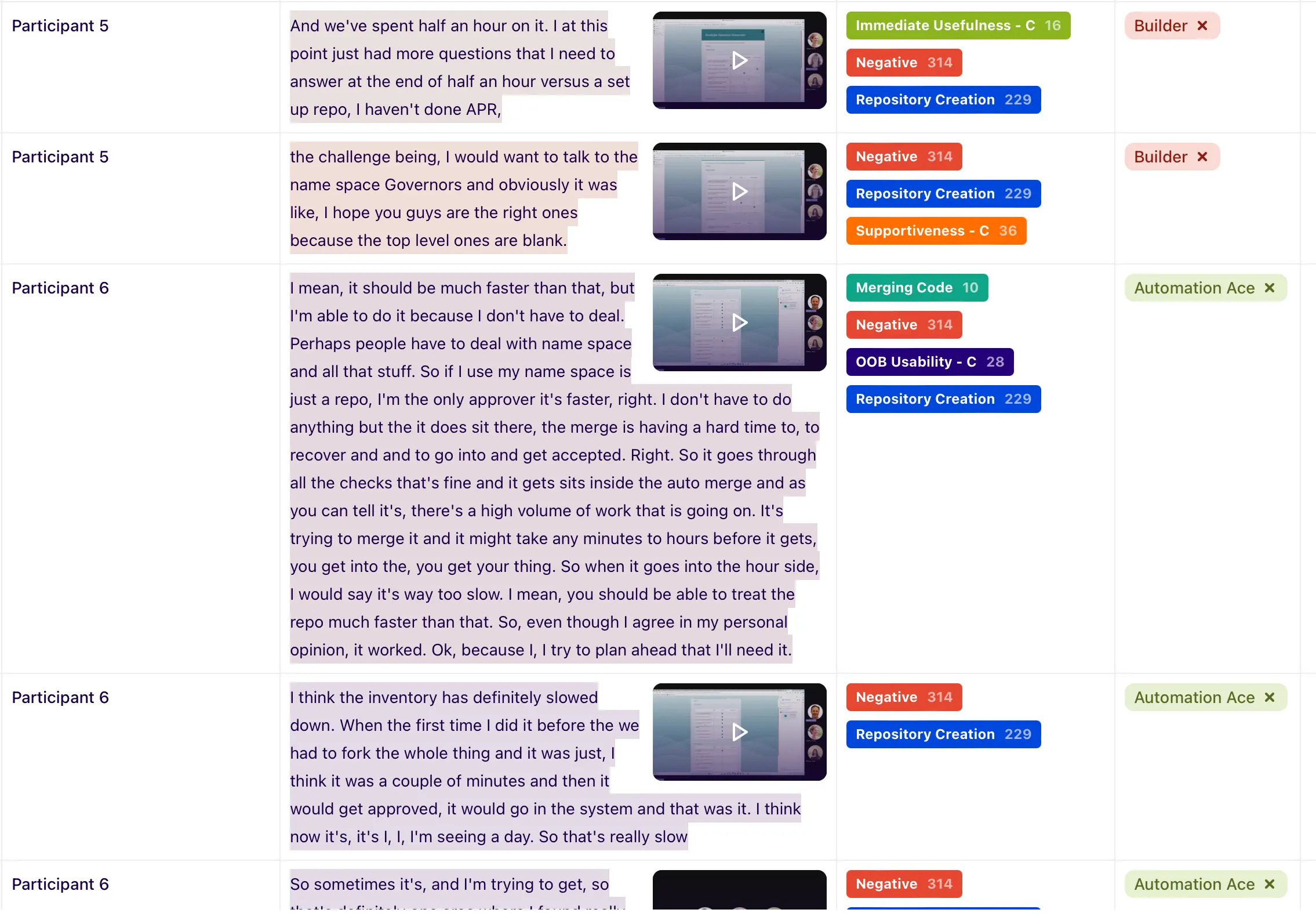
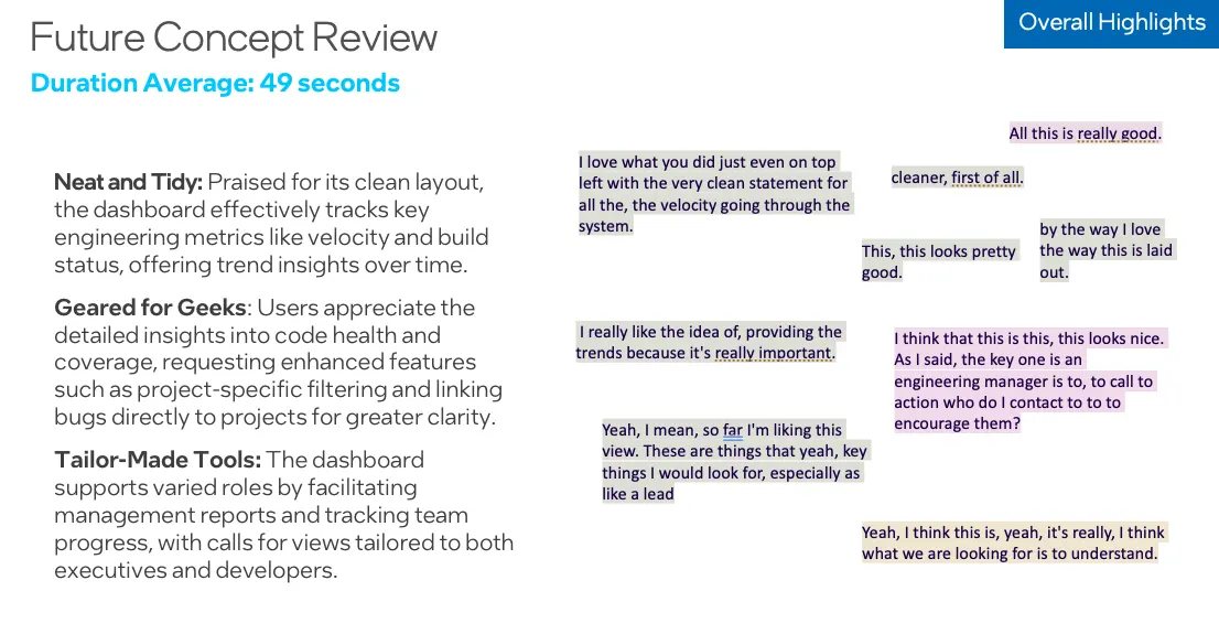
I began by analyzing the current dashboards and working closely with engineering community to identify key issues. I created personas with targeted goals, then validated with a survey to the community for prioritizing the top metrics. I created and tested new design concepts based on the feedback, leading to a redesigned dashboard. The new design testing results came in at 49 seconds, ensuring users were able to understand metrics within 60 seconds, achieving a significant improvement.
Tools & Methods
ChatGPT
DXA Research
Qualtrics
Yammer
Figma
Dovetail
PowerPoint
Azure Data Explorer
Jira
Research using ChatGPT for expanded personas, then validated
DXA results for role levels
Created a survey for prioritizing metrics of interest
Leveraged yammer communities for questions and validation
Figma used for creation of designs
Dovetail was used for capturing all user testing sessions and data insights extracted
Powerpoint for presenting out findings
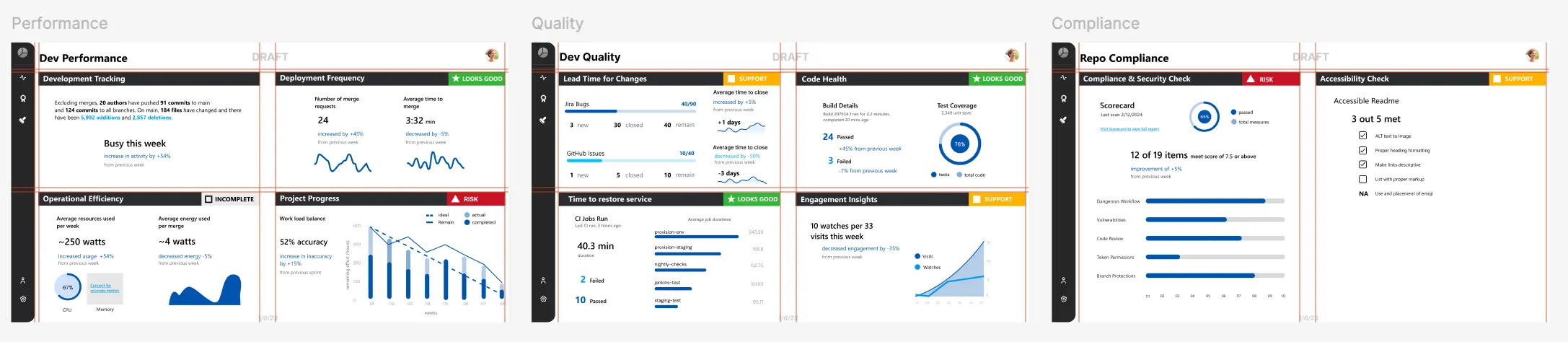
Final metrics developed in Azure Data Explorer
Work tracked in Jira